

YEKO RISE
dont forget to visit Yeko Portfolio at www.yeko.co.uk


This one is dedicated to my friend Jorge since he is the one that pushed for this one.
Very self explanatory Mexican Gangster dude with tattoos, I put LUPITA on his chest to resemble how cholos get their gf names tattooed, I had a lot of fun with this Yeko Monito, that i had to make two versions one without a shirt and the other one with the usual cholo outfit.
so here it is today's design CHOLO!
dont forget to visit the yeko portfolio or go to www.yeko.co.uk

EL CHAPULIN COLORADO...
The Red Grasshopper was a tv series back in the 70's and 80's i think?
and it is still very popular these days, I think it has become part of the Mexican culture, I want to make a whole series of monitos for Chespirito, I just hope i don't get in trouble, but for now here it is El Chapulin Colorado
don't forget to visit my portfolio at: www.yeko.co.uk | or Click here to visit Yeko's Portfolio


Finally I am back!!!
I have been so busy with work and other projects that I havent post in a long time, but here I am again.
About two weeks go I attended the Latinos in Action Conference, and met a couple of dudes from Cool Speak, Carlos Ojeda Jr. and Ernesto Mejia, I was very impressed with them, so I promise I'd make them a Monito.
and here they are. Carlos I based his cartoon on the facial expression I though he was making when he graduated from High School and his friends were all shouting CHU CHU, and Ernesto's was all about his outfit, vest and tie.
dont forget to visit my portfolio at www.yekoc.o.uk
You can also check out Carlos, Ernesto and other cool speakers at: http://www.coolspeakers.net/
You can also check out Carlos, Ernesto and other cool speakers at: http://www.coolspeakers.net/

I started restoring my yeko portfolio, to a more personal portfolio instead of a commercial portfolio I have been kinda busy lately with other projects, that is why i havent have much time to launch my portfolio, but today i created one of the sliders for it, and i it is about my Monito Series, I hope you all like it, don't forget to like my Yeko Facebook page.

Obviously a Valentine's day post.
I don't really have someone to make cartoons for, for valentines so...
Super self explanatory what would cupid say to all those who don't have a significant other to celebrate valentines with. I mean its obvious that you can celebrate with people you love such as your family and friends, but our society usually makes it about romantic relationships so here it is, a cupid who ran out of arrows.

This is a little out of my style, but this wasn't originally my idea.
About a week ago my friend Mauricio Pablo posted a picture of one of his drawings on fb, we talked and he made a sketch so I could make it digital.
About a week ago my friend Mauricio Pablo posted a picture of one of his drawings on fb, we talked and he made a sketch so I could make it digital.
So here it is, I made some changes to the original sketch based on my abilities, and what i thought it was best for the design of the sketch. by the way this made me remember why I always try to keep it simple, it is a pain to be drawing every little detail, specially because if you know me you know I am not good at drawing, and it takes me double the time t
o come up with stuff like that, but I was really happy with the overall result, what I like the most are the cracks on the heart.
I posted a picture of the progress, It started with Mauricio's sketch, when to Illustrator, and finished details in Photoshop.
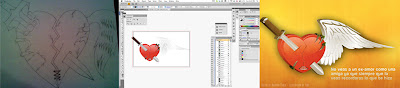
Dont forget to visit my portfolio www.yeko.co.uk

I haven't posted in who knows how long but oh well
The Latinos in Action (a nonprofit i work for) confeence is coming up in March, a lot of the colleges and universities here in Utah have a chapter of Latinos in Action at their school, and they are all going to be at the conference.
So thats what my post is about today, I woke up at 5:30 AM today i have no clue WHY!, but instead of wasting time laying in bed i started designing the shirts for the Colleges, and this is what i came up with.
by the way the picture is kinda big, so it might take a minute or two to load
dont forget to visit my portfolio at www.yeko.co.uk (it is under construction right now but it will be up this week)

Honor a quien honor merece! its al old saying from back home. It is more than obvious why today's design is about Martin Luther King JR.
But more than just being Martin Luther King JR. I did it because he is a very big influence.
Live by example they say and i think one of the best examples you can live by is this man's, there is a quote from him that I LOVE and made me want to make a tribute design about him today
“Our lives begin to end the day we become silent about things that matter.”
so here it is i hope you all like it. Don't forget to visit my portfolio at: www.yeko.co.uk

I am sure this time this is it. the one and only!

As most of you know i do work for Latinos in Action a non-profit organization, well OUR annual conference is coming up in march so I was asked to do a Teaser for the conference, so here it is.

Going back to creating characters with shapes, and after almost a week of not coming up with anything new, I give you POLECIA.
Its suppose to be Policia, but back home people who are stereotypical from a lower class or considered not educated use pronounce the word like this.
This guy is a clingy cop from Yekotitlan the name of a town I invented.
Remember to visit my portfolio at: www.yeko.co.uk

This morning I was more than committed to designing a permanent logo once and for all, but the outcome wasn't what I expected.
I love the colors, and I think that's what I am gonna stick with, the target was to go for that Japanese-ish look, the white in the middle its suppose to be a Y, but it ended up looking a lot like the Adobe Flash logo (i think) I also got someone else's opinion and they said it looked a lot like an office logo, and the 3d wasn't very convincing, and I kinda agree, so since i didn't want these three samples to go to waste AND since I will probably play video games with my son the rest of the afternoon, i wont have time to make another one, but I am hoping to have one by monday.

El Maistro (the mechanic) Its suppose to be El Mecanico which actually means The Mechanic but Maistro is what we call them back home, some....
SUPER SIMPLE!
thats what I usually aim for, and to be honest i think this one is one of my favorites, i think i just found the shape for all my characters.
This guy is wearing his nice blue coveralls, and his yeko clothing hat ofcourse.
Dont forget to visit my portfolio at www.yeko.co.uk

Today's design was very special, because it was inspired by my son Ale, he drew it on a piece of paper, and we both traced it on illustrator.
He was very exited about it, everything started super cute, and lets do a cute huevo (egg) then I dont know if it was the fact that he is not over halloween yet, but he wanted sharp teeth and a crack on the egg, he even wanted a sword but we ran out of time maybe I can put one on later, when it was done he goes "PAPI THAT LOOKS EVIL" so thats where the Evil Hu
evo comes from, I had alot of fun doing this with him, he keeps talking about being a designer and wanting to make cartoons like his dad, happiness.
I also included a picture of the before and after, Ale loved it!


While browsing pictures on the computer I came across a picture from a guy doing graffiti, and it reminded me of the time when I used to do crappy gratifies on walls back home, so I said why not, drop the mouse and lets go back to color pencils and paper.
This is a graffiti of my sons name "Alessandro" Im usually not that bad at outlining or coming up with the idea, BUT when it comes to filling the art with color I ruin it, so I let him pick the colors, and this is the result.
P.D
(not that anyone cares) I misplaced my camera charger so the pictures look really crappy because they were taken with my phone, which in fact gave me the idea for tomorrows design, a picture with my phone and try making it look as if it was taken by a pro.

Day two of Design in a Day, i was thinking about making a JellyFish, but SOMEONE Im not gonna say names (Adriana) Recommended that I illustrated my Facebook status, I was thinking about doing some characters to illustrate it but that would have taken me way more than a day, so i just decided to use typography and had fun with it, i hope everyone likes it, at some point im going to upload the PSD in case anyone wants to use this file
oh BTW my Facebook status was...
"Dance like the photo isn’t being tagged, love like you’ve never been unfriended, and status update like nobody is liking."

I decided to pick this tutorial to improve my illustrator skills i also loved the colors used for the sun, they are bright and very eye catching, and it looks very simple but nice, there are a few things I think I could change but this was good for now. I hope Ya'll like it.
I found the tutorial in some website, I wanted to give credit to the author but i couldn't find it, oh well.
I found the tutorial in some website, I wanted to give credit to the author but i couldn't find it, oh well.


